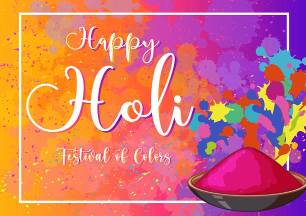
When it comes to festival poster design, color is more than just an aesthetic choice; it’s a powerful tool that can influence emotions, convey messages, and attract attention. The right color palette can make your poster stand out in a crowded festival environment and resonate with your target audience. Here’s a deep dive into the power of color in festival poster design and how you can harness it to create compelling visual communications.

Table of Contents
Toggle1. Understanding Color Psychology
Color psychology is the study of how colors affect human behavior and emotions. Different colors can evoke different feelings and reactions, making it essential to choose your color palette carefully. Here’s a brief overview of how various colors are perceived:
- Red: Excitement, energy, passion. It’s attention-grabbing and often used for promotions or urgent messages.
- Blue: Trust, calmness, and professionalism. It’s a popular choice for brands that want to convey reliability.
- Yellow: Happiness, optimism, and warmth. This color can evoke feelings of cheerfulness and is often used in summer festival themes.
- Green: Nature, growth, and tranquility. Ideal for eco-friendly festivals or events centered around wellness.
- Purple: Creativity, luxury, and mystery. It can add a touch of elegance and intrigue to your design.
- Orange: Enthusiasm, friendliness, and adventure. This color can make your poster feel approachable and energetic.
- Black: Sophistication, elegance, and power. It can create a striking contrast when paired with brighter colors.
Understanding these associations allows you to select colors that align with the festival’s theme and your brand identity.
2. Creating Visual Hierarchy with Color
Colors can help establish a visual hierarchy in your poster design, guiding the viewer’s eye to the most important elements. Here are some ways to effectively use color to create hierarchy:
- Contrast: Use contrasting colors to differentiate between various elements. For example, if your background is dark, using light-colored text will make it stand out.
- Color Weight: Bright, saturated colors tend to draw attention first, while muted colors recede into the background. Use this to emphasize the most crucial information, such as the festival name and date.
- Grouping: Use similar colors to group related information. For instance, if you have several bands performing, you might use a specific color to highlight that section of the poster.
3. Setting the Mood and Theme
The color palette you choose can set the mood and reinforce the festival’s theme. For example, earthy tones like browns and greens can evoke a rustic, outdoor vibe, ideal for a nature or eco-festival. In contrast, vibrant colors like pinks and yellows can create a lively, upbeat atmosphere for music festivals. Consider the emotions you want to evoke and choose a color palette that aligns with your vision.
4. Cultural Considerations
Colors can have different meanings in various cultures, so it’s important to consider your audience when selecting your color palette. For example, while white symbolizes purity in Western cultures, it can represent mourning in some Eastern cultures. Research the cultural significance of colors, especially if your festival attracts a diverse audience, to ensure your design resonates positively.
5. Using Color for Branding
If your small business is sponsoring a festival or participating in one, consistent color use can strengthen your brand identity. Incorporate your brand colors into your festival poster design to create cohesion with your other marketing materials. This consistency can make your brand more recognizable and memorable to festival-goers.
6. Testing Your Color Palette
Before finalizing your festival poster, consider testing your color choices with a focus group or through social media polls. Getting feedback on how people perceive your color palette can provide valuable insights and help you make informed design decisions. This approach ensures your colors resonate with your target audience and effectively convey the intended message.
7. Incorporating Color Trends
Keeping an eye on color trends can help your festival poster feel fresh and modern. Research design trends and consider incorporating popular color palettes that align with your festival’s theme. Websites like Pantone or design blogs can provide inspiration for trendy color combinations that are currently in vogue.
Conclusion
The power of color in festival poster design cannot be overstated. By understanding color psychology, creating visual hierarchy, and considering cultural contexts, you can design posters that not only capture attention but also evoke the desired emotions. Remember to incorporate your brand identity and stay updated on current color trends for the best results. With thoughtful color choices, your festival poster can become a powerful marketing tool that resonates with your audience and enhances the overall experience of your event. Happy designing!


No responses yet