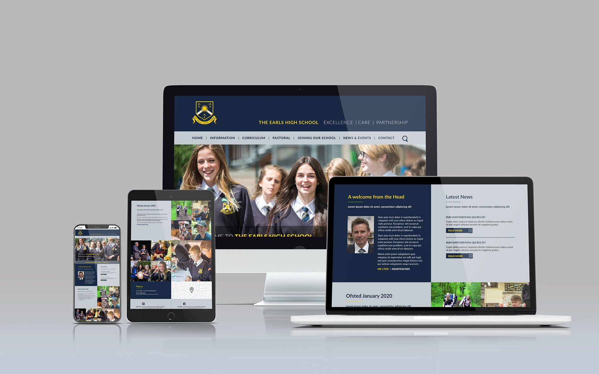
In today’s digital age, having a strong online presence is essential for schools to effectively communicate with students, parents, and the community. One of the most crucial elements of this online presence is a responsive web design. A responsive design ensures that your school website adapts seamlessly to various devices and screen sizes, providing an optimal user experience for everyone. Here’s why responsive design is vital for school websites.
Table of Contents
Toggle1. Improved User Experience
A responsive design enhances user experience by ensuring that visitors can access your website on any device—be it a smartphone, tablet, or desktop computer. Here are some key benefits:
- Accessibility: Parents, students, and staff can easily navigate your website, no matter the device they are using. This accessibility is particularly important for parents who may be using mobile devices to access information quickly.
- Consistent Navigation: A responsive design maintains consistent navigation across devices, making it easy for users to find important information like school calendars, news updates, and contact details.
2. Increased Mobile Traffic
With more people accessing websites via mobile devices, having a responsive design is essential for capturing this audience. Consider the following:
- Mobile Optimization: A responsive design optimizes your school website for mobile users, ensuring fast loading times and easy readability. This can lead to increased traffic as more users are able to access your site without frustration.
- Higher Engagement Rates: When users can easily browse your website on their mobile devices, they are more likely to engage with your content, whether it’s checking the latest school news or exploring academic programs.
3. Better Search Engine Ranking
Search engines, particularly Google, prioritize mobile-friendly websites in their rankings. Here’s how responsive design impacts your school’s visibility:
- SEO Benefits: Responsive design can improve your website’s search engine optimization (SEO) efforts. Google rewards sites that offer a seamless experience across devices, which can lead to higher search rankings and more visibility for your school.
- Reduced Bounce Rates: A well-designed, responsive website can decrease bounce rates—when visitors leave your site quickly—by providing a better user experience. Lower bounce rates are a positive signal to search engines, further enhancing your SEO performance.
4. Cost-Effectiveness
Maintaining separate websites for mobile and desktop users can be costly and time-consuming. A responsive design offers a more efficient solution:
- Single Website Management: With responsive design, you only need to manage one website rather than multiple versions. This simplifies updates, content management, and overall maintenance, saving both time and resources.
- Future-Proofing: A responsive design is built to adapt to future devices and technologies, reducing the need for constant redesigns as new devices are released.
5. Enhanced Accessibility for All Users
In addition to being mobile-friendly, a responsive design can improve accessibility for users with disabilities:
- Screen Readers: A responsive design can be optimized to work with screen readers, making it easier for visually impaired users to navigate your website.
- Keyboard Navigation: Ensuring that your website is navigable using a keyboard is crucial for users with mobility impairments. Responsive design can facilitate this by allowing users to access all features without relying solely on a mouse.
6. Effective Communication
Schools often have a variety of stakeholders to communicate with, including students, parents, staff, and the community at large. A responsive design enhances communication by:
- Timely Updates: With a responsive website, you can quickly share important announcements, event information, and other updates, ensuring that everyone stays informed, regardless of their device.
- Increased Parent Engagement: Parents are more likely to engage with your school’s website if it’s easy to navigate on their devices, leading to stronger connections between the school and families.
7. Showcasing School Culture and Values
A well-designed, responsive school website can effectively showcase your school’s culture, values, and achievements:
- Visual Storytelling: Use images and videos to highlight school events, student achievements, and community involvement. A responsive design ensures that these visuals are presented beautifully on all devices, enhancing storytelling.
- Building Community: By providing a platform that is easy to access and navigate, you foster a sense of community among students, parents, and alumni. This can lead to increased participation in school activities and events.
Conclusion
Incorporating a responsive design into your school website is not just a technical necessity; it’s a fundamental aspect of effective communication and engagement in today’s digital landscape. By improving user experience, increasing mobile traffic, enhancing search engine rankings, and ensuring accessibility for all users, a responsive design can significantly benefit your school community. Investing in a responsive website design is an investment in your school’s future, helping you connect with students, parents, and the community in a meaningful way. As technology continues to evolve, a responsive design will ensure that your school remains relevant and accessible to everyone.
No responses yet