
In an era where mobile apps dominate the digital landscape, creating an application that functions seamlessly across all devices is crucial for maximizing user engagement and satisfaction. With a diverse range of screen sizes, operating systems, and hardware capabilities, developers face unique challenges. This blog will explore the best practices for building a mobile app that works flawlessly on all devices, ensuring a consistent and enjoyable user experience.
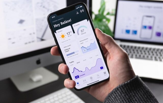
Table of Contents
Toggle1. Adopt a Responsive Design Approach
Flexible Layouts
Responsive design is a fundamental principle for ensuring that your app adapts to various screen sizes and orientations. Use flexible layouts that automatically adjust elements based on the screen dimensions. Techniques such as relative units (like percentages) instead of fixed units (like pixels) can help create fluid designs.
Media Queries
Utilize media queries in your CSS to apply different styles based on device characteristics, such as width, height, and resolution. This enables you to tailor the layout for smartphones, tablets, and larger screens, providing a consistent experience across devices.
2. Optimize for Different Operating Systems
Cross-Platform Development
Consider using cross-platform development frameworks like React Native, Flutter, or Xamarin. These frameworks allow you to write code once and deploy it on multiple operating systems (iOS and Android), saving time and effort while maintaining consistent functionality.
Native Features
While cross-platform frameworks are advantageous, don’t overlook the importance of utilizing native features unique to each operating system. For example, take advantage of Apple’s Human Interface Guidelines for iOS and Google’s Material Design for Android to create native experiences that users expect.
3. Prioritize Performance and Speed
Optimize App Size
A large app size can deter users from downloading or updating your application. Optimize your app’s size by compressing images, removing unnecessary libraries, and using code splitting to load only the necessary components. Aim for a lightweight app that downloads quickly and runs efficiently.
Minimize Load Times
Users expect apps to load quickly, regardless of their device. Optimize performance by:
- Reducing API Call Frequency: Minimize the number of API calls and ensure that data retrieval is efficient.
- Caching Data: Implement caching mechanisms to store frequently accessed data locally, reducing load times.
4. Test on Multiple Devices and Screen Sizes
Device Diversity
To ensure that your app functions well across all devices, conduct thorough testing on various devices with different screen sizes, resolutions, and operating systems. This helps identify and fix any issues that may arise due to specific hardware or software configurations.
Emulators and Real Devices
While emulators can be useful for initial testing, they may not replicate real-world conditions accurately. Always test your app on physical devices to observe how it performs in different environments and scenarios.
5. Focus on User Experience (UX) Design
Intuitive Navigation
A well-structured and intuitive navigation system enhances user experience across devices. Ensure that your app’s navigation is clear and easy to use, regardless of screen size. Use recognizable icons, simple labels, and consistent design patterns to help users navigate effortlessly.
Touch-Friendly Elements
Ensure that interactive elements are large enough to be easily tapped on smaller screens. Follow the recommended touch target sizes (typically at least 44×44 pixels) to enhance usability and prevent frustration.
6. Implement Accessibility Features
Design for Inclusivity
Accessibility should be a core consideration when building your app. Incorporate features such as screen reader compatibility, adjustable font sizes, and high-contrast color schemes to make your app usable for people with disabilities.
Follow Guidelines
Refer to the Web Content Accessibility Guidelines (WCAG) and mobile accessibility guidelines to ensure that your app meets accessibility standards and provides a positive experience for all users.
7. Regular Updates and Feedback Integration
Iterative Improvement
The mobile app landscape is constantly evolving, and so are user expectations. Regularly update your app to introduce new features, improve performance, and fix bugs. This commitment to improvement helps retain users and attract new ones.
Gather User Feedback
Encourage users to provide feedback on their experiences with your app. Use surveys, app store reviews, and analytics to gather insights on what users like and dislike. Act on this feedback to refine your app and enhance user satisfaction.
Conclusion
Building a mobile app that works on all devices requires careful planning, design, and execution. By adopting a responsive design approach, optimizing performance, prioritizing user experience, and conducting thorough testing, you can create an app that meets the needs of a diverse user base. Emphasizing accessibility and regularly updating your app based on user feedback will further enhance its usability and relevance in an ever-changing digital landscape. With these best practices in mind, you’ll be well-equipped to develop a successful mobile app that stands out in today’s competitive market.
No responses yet