When designing festival posters, the choice of font can greatly impact the overall vibe and effectiveness of the poster. Here are some of the best fonts for festival posters, categorized by style:
Bold and Eye-Catching
- Bebas Neue: A sans-serif font known for its clean lines and bold presence. Great for headings and titles.
- Anton: A modern sans-serif typeface that stands out with its bold weight and geometric shapes.
- Oswald: A reworking of the classic gothic typeface style, perfect for adding a contemporary touch.
Artistic and Playful
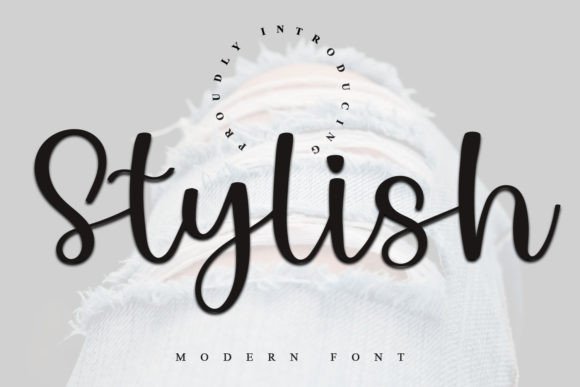
- Pacifico: A casual script font that adds a friendly, approachable feel, ideal for music or arts festivals.
- Lobster: A bold, cursive font that conveys a fun and vibrant energy, great for creative events.
- Raleway: A stylish sans-serif font with various weights, offering versatility for both headings and body text.
Vintage and Retro
- Playfair Display: A serif font that brings a touch of elegance and sophistication, perfect for more upscale festivals.
- Bodoni: A classic serif font that offers a vintage feel, ideal for arts and crafts festivals.
- Futura: A geometric sans-serif typeface that works well for retro-themed events.
Fun and Quirky
- Fredericka the Great: A whimsical, hand-drawn typeface that adds a unique character to festival posters.
- Pangram: A bold, slightly distorted font that feels fun and energetic, perfect for lively events.
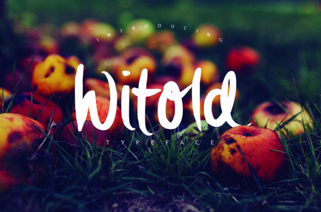
- Dancing Script: A lively script font that gives a sense of movement and excitement.
Modern and Minimalistic
- Helvetica Neue: A timeless classic that is versatile and professional, suitable for almost any festival.
- Montserrat: A modern sans-serif font that is clean and easily readable, great for contemporary festivals.
- Source Sans Pro: A humanist sans-serif font that is highly legible and professional, suitable for information-heavy posters.
Tips for Choosing Fonts:
- Hierarchy: Use different fonts for headings, subheadings, and body text to create visual hierarchy.
- Readability: Ensure that your chosen fonts are easily readable from a distance, especially important for festival posters.
- Theme Alignment: Choose fonts that align with the festival’s theme (e.g., music, arts, food) to enhance the overall aesthetic.
- Contrast: Use contrasting font styles (e.g., bold vs. light, serif vs. sans-serif) to create visual interest.
No responses yet