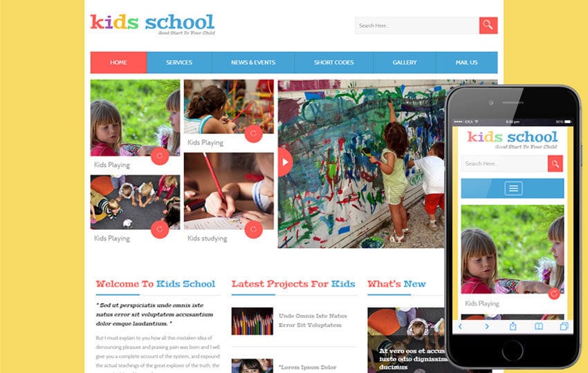
A visually appealing and functional image gallery can greatly enhance a school website, showcasing events, achievements, and campus life. A responsive image gallery ensures that images display beautifully on all devices, from desktops to smartphones. Here’s how to create an engaging and responsive image gallery for your school website.

Table of Contents
Toggle1. Choose the Right Platform
Before creating an image gallery, consider the platform your school website is built on. Popular content management systems (CMS) like WordPress, Joomla, or Drupal often have built-in gallery features or plugins that can simplify the process. If you’re using a static site, HTML and CSS will be your primary tools.
2. Select a Gallery Style
The style of your gallery can significantly impact user experience. Here are a few popular options:
- Grid Layout: A clean and organized look where images are displayed in a grid format. Ideal for showcasing multiple images at once.
- Masonry Layout: Similar to a grid but with images of varying heights, creating a more dynamic visual effect.
- Carousel/Slider: Allows users to scroll through images one at a time, perfect for featured images or events.
Decide which style best fits your content and design aesthetic.
3. Optimize Images for Web Use
High-quality images are essential, but large file sizes can slow down your website. Here’s how to optimize images:
- Resize Images: Use image editing software to resize images for web use. Aim for dimensions that suit your gallery layout without sacrificing quality.
- Compress Images: Use tools like TinyPNG or ImageOptim to reduce file sizes without losing quality.
- Use the Right Format: JPEG is typically best for photographs, while PNG is suitable for images with transparency.
4. Implement Responsive Design with CSS
To ensure your image gallery is responsive, you’ll need to use CSS. Here’s a simple example of how to set up a responsive grid layout:
.gallery {

display: grid;

grid-template-columns: repeat(auto-fill, minmax(300px, 1fr));

gap: 10px;

}width: 100%;
height: auto;
border-radius: 5px;
}
In this example, grid-template-columns creates a flexible grid that adapts to the screen size, while gap adds space between images. The img styling ensures that images fill their grid cells while maintaining their aspect ratio.
5. Add Lightbox Functionality
A lightbox effect allows users to click on an image to view it in a larger format, enhancing the user experience. Many JavaScript libraries, like Lightbox2 or Fancybox, can be easily integrated. Here’s a basic example using Lightbox2:
- Include Lightbox CSS and JS:
<link href="path/to/lightbox.css" rel="stylesheet">

<script src="path/to/lightbox.js"></script>
- Modify Image Links:
<div class="gallery">

<a href="image1_large.jpg" data-lightbox="gallery">

<img src="image1_thumbnail.jpg" alt="Description of image 1">

</a>

<a href="image2_large.jpg" data-lightbox="gallery">

<img src="image2_thumbnail.jpg" alt="Description of image 2">

</a>

<!-- Add more images as needed -->

</div>
6. Create Captions and Alt Text
Captions provide context for each image and enhance accessibility. Use the <figcaption> element for captions and ensure all images have descriptive alt text for screen readers and SEO benefits. For example:
<figure>

<a href="image1_large.jpg" data-lightbox="gallery">

<img src="image1_thumbnail.jpg" alt="Students participating in a science fair">

<figcaption>Students participating in a science fair</figcaption>

</a>

</figure>
7. Test Across Devices and Browsers
After setting up your gallery, thoroughly test it across various devices (smartphones, tablets, and desktops) and browsers (Chrome, Firefox, Safari) to ensure it displays correctly. Pay attention to load times and responsiveness, making adjustments as necessary.
8. Keep Content Updated
An image gallery is most effective when it showcases current events and activities. Regularly update the gallery with new images and remove outdated ones. This practice not only keeps your content fresh but also encourages visitors to return to the site for new updates.
9. Promote the Gallery
Once your gallery is live, promote it through newsletters, social media, and school events. Encourage teachers, students, and parents to contribute photos for a more comprehensive representation of school life.
Conclusion
Creating a responsive image gallery for your school website is a fantastic way to engage visitors and showcase the vibrant community. By choosing the right platform, optimizing images, and implementing responsive design techniques, you can create a gallery that not only looks great but also enhances the overall user experience. Regular updates and promotions will keep your gallery relevant and inviting, helping to foster a sense of community within your school.
No responses yet