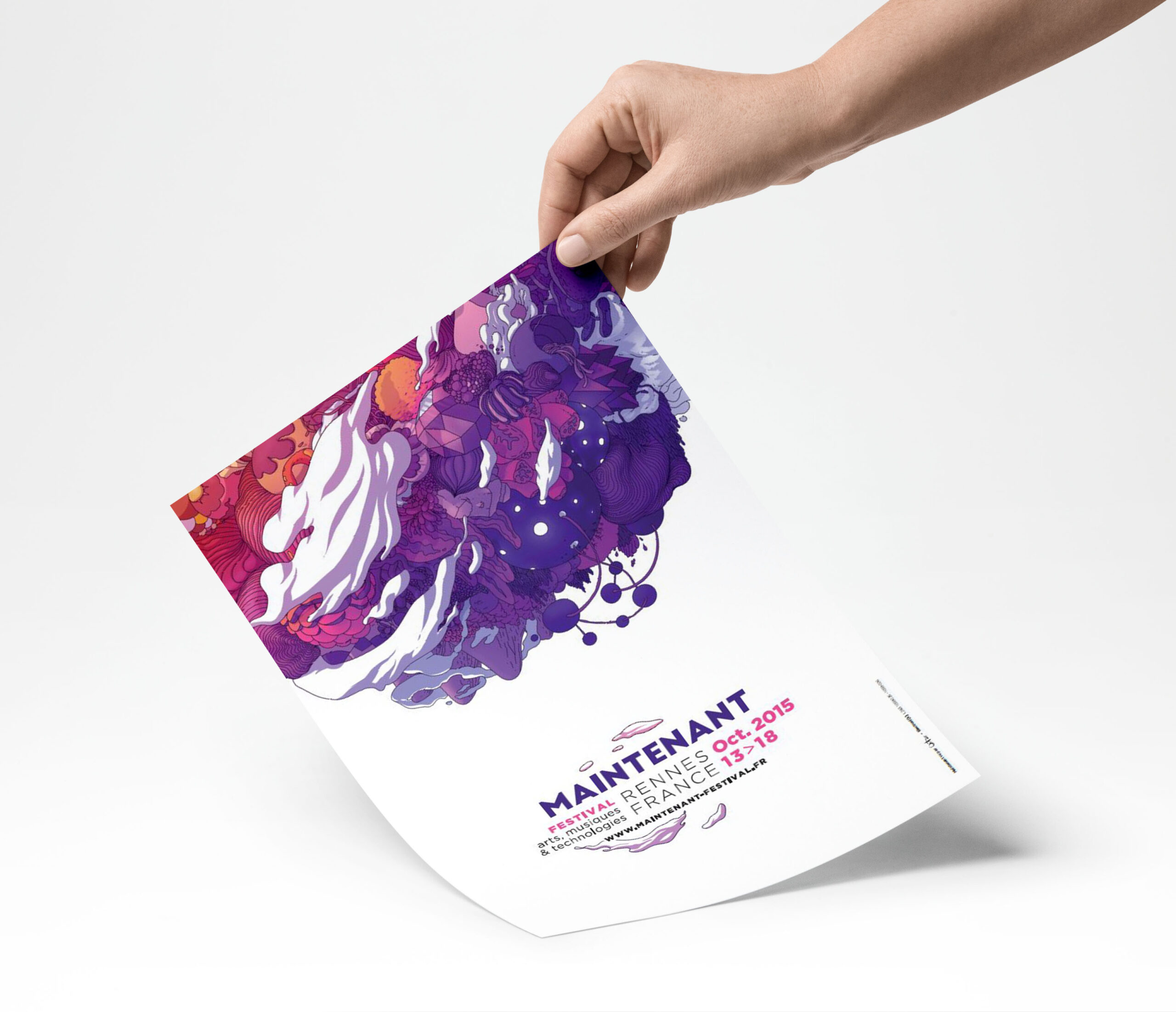
Creating a minimalist festival poster is an art form that combines simplicity, clarity, and creativity. Minimalism is all about stripping away the excess and focusing on the essential elements that convey your message. In a world full of visual noise, a well-designed minimalist poster can stand out and effectively communicate your festival’s identity. Here’s a step-by-step guide on how to create striking minimalist festival posters that capture attention and convey information efficiently.
Table of Contents
Toggle1. Understand the Essence of Minimalism
Before you start designing, it’s crucial to grasp the core principles of minimalism:
- Simplicity: Focus on essential elements; avoid clutter.
- Whitespace: Use negative space to enhance readability and draw attention to important features.
- Limited Color Palette: Stick to a few colors to create a cohesive look.
- Typography: Select clean, legible fonts that reflect the festival’s theme.
2. Define Your Concept
Every poster should have a clear concept that resonates with your audience. Consider the following:
- Festival Theme: Is it music, art, food, or culture? Ensure your design reflects the festival’s vibe.
- Target Audience: Know who you’re designing for; their preferences will guide your choices.
- Key Information: Identify what details are crucial (e.g., date, location, headliners) and prioritize them.
3. Choose the Right Tools
Several design tools can help you create a minimalist festival poster. Here are a few popular options:
- Adobe Illustrator: Great for vector graphics and precision.
- Canva: User-friendly with plenty of templates and design elements.
- Figma: Excellent for collaborative design work.
- Affinity Designer: A cost-effective alternative to Adobe products.
4. Select a Color Palette
A limited color palette is vital in minimalist design. Choose two to four colors that complement each other and evoke the right emotions. Consider using:
- Bold Colors: To grab attention.
- Muted Tones: For a more sophisticated feel.
- Contrasting Shades: To ensure readability and focus on key elements.
5. Focus on Typography
Typography plays a significant role in minimalist design. Here’s how to make it work:
- Font Selection: Choose one or two fonts that align with your festival theme. Sans-serif fonts often work well for a clean look.
- Hierarchy: Use different font sizes and weights to emphasize important information. For example, the festival name should be the most prominent element.
- Spacing: Ensure proper spacing between letters and lines for readability.
6. Incorporate Imagery Wisely
If you choose to include images or graphics, do so thoughtfully:
- Iconography: Use simple icons or symbols that represent your festival’s theme.
- Photography: If you include photos, opt for high-quality images with ample whitespace around them.
- Textures: Subtle textures can add depth without overwhelming the design.
7. Create a Layout
A well-structured layout enhances readability and visual appeal. Consider these layout principles:
- Grid System: Use a grid to align elements and maintain balance.
- Focal Point: Determine what the main focal point is and arrange the other elements around it.
- Flow: Ensure the viewer’s eye naturally moves from one element to the next.
8. Test and Iterate
Once you’ve created a draft of your poster, gather feedback from peers or potential attendees. Here are some questions to consider:
- Is the information clear and easy to read?
- Does the design reflect the festival’s vibe?
- Are there any elements that feel cluttered or unnecessary?
Be open to making adjustments based on feedback. Sometimes, removing a single element can enhance the overall design significantly.
9. Print and Distribute
After finalizing your design, prepare it for print. Ensure your file is high resolution and adheres to the printing guidelines. Consider the following:
- Material: Choose durable paper or a unique texture that enhances the design.
- Size: Standard sizes include A2 or A3, but custom sizes can make your poster stand out.
- Distribution: Plan where and how you will distribute the posters to reach your target audience effectively.
Conclusion
Creating minimalist festival posters is an exciting opportunity to express creativity while effectively conveying essential information. By focusing on simplicity, clarity, and thoughtful design choices, you can produce eye-catching posters that resonate with your audience. Remember, less is often more, and with the right approach, your minimalist poster can leave a lasting impression. Happy designing!
No responses yet