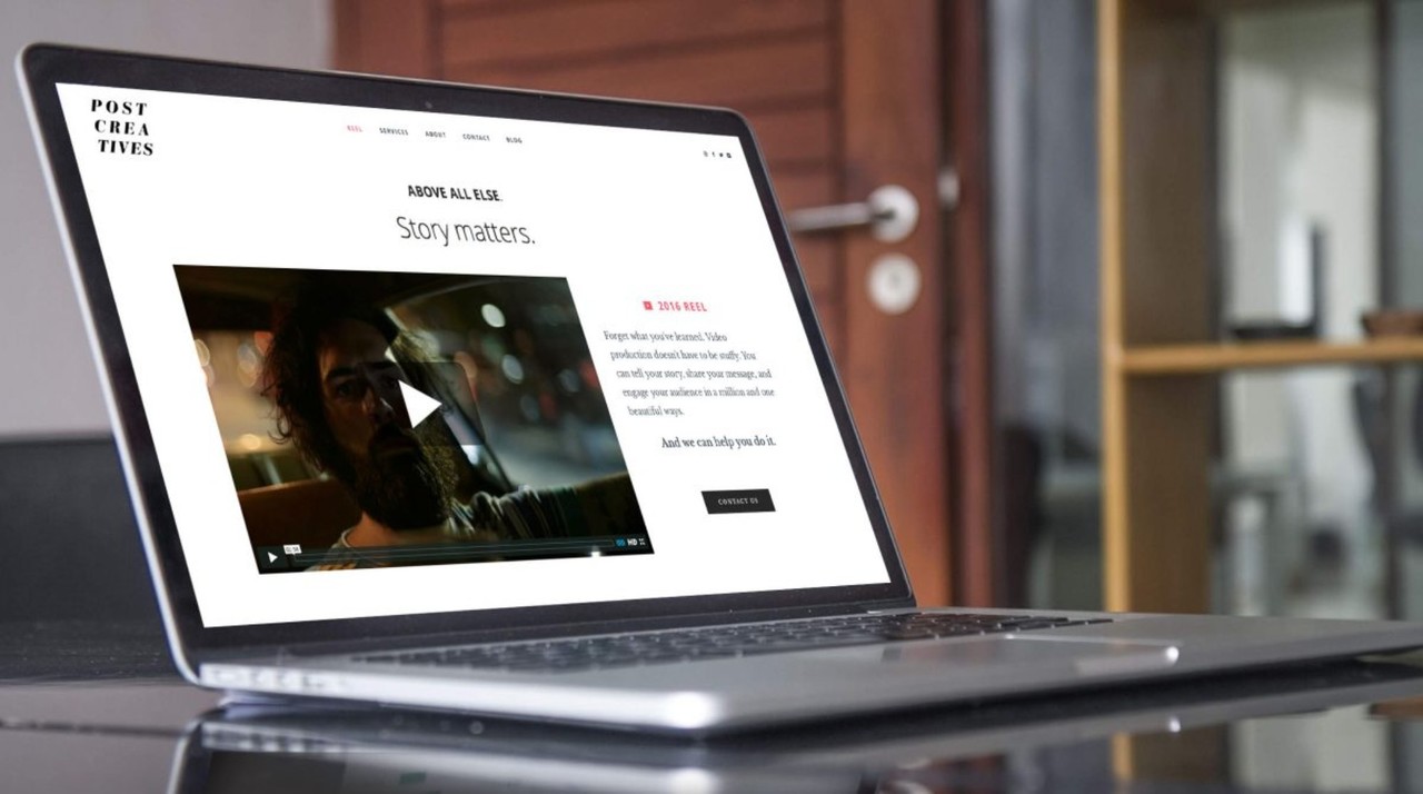
Website navigation is a critical component of user experience (UX). It serves as the roadmap for visitors, guiding them through your site and helping them find the information they seek. When navigation is intuitive and user-friendly, it can significantly enhance user satisfaction and encourage visitors to explore further. Here are some essential website navigation tips to improve user experience and keep your audience engaged.

Table of Contents
Toggle1. Keep Navigation Simple and Intuitive
Simplicity is key when it comes to website navigation. A cluttered or complicated menu can confuse users and lead to frustration. Consider these tips:
- Limit Menu Items: Aim for a maximum of 5-7 primary menu items. This prevents overwhelming users with too many options and makes it easier for them to find what they’re looking for.
- Use Clear Labels: Menu items should have clear and descriptive labels that accurately convey what users can expect to find when they click. Avoid jargon and opt for straightforward language.
- Organize Logically: Structure your navigation in a way that makes sense. Group related items together and consider using submenus for categories that require further breakdown.
2. Implement a Responsive Design
With the growing number of users accessing websites on mobile devices, responsive design is essential. Ensure your navigation adapts seamlessly to different screen sizes:
- Mobile-Friendly Menus: Use hamburger menus or collapsible navigation for mobile devices to save screen space while still providing easy access to all sections.
- Touch-Friendly Buttons: Make sure buttons and links are large enough for users to tap easily, reducing the likelihood of misclicks on small screens.
3. Use Breadcrumbs
Breadcrumbs provide a secondary navigation system that shows users their current location within your site’s hierarchy. This not only enhances usability but also aids in SEO.
- Enhance Navigation: Breadcrumbs allow users to backtrack easily to previous sections without having to use the back button. This is particularly useful on larger sites with multiple layers of content.
- Improve SEO: Search engines appreciate breadcrumb navigation as it helps them understand your site’s structure, potentially improving your search ranking.
4. Incorporate a Search Functionality
A search bar is a valuable addition to any website, especially for larger sites with extensive content.
- Accessibility: Place the search bar in a prominent location, such as the top right corner of the homepage. Make it easily accessible so users can quickly find it when needed.
- Auto-Suggestions: Implement auto-suggestions in the search bar to help users find relevant content as they type. This can improve the user experience and encourage them to explore further.
5. Highlight Important Pages
If certain pages are critical for your business, such as services, contact information, or special promotions, ensure they are easy to find.
- Use Sticky Navigation: Sticky menus remain visible at the top of the screen as users scroll down the page. This keeps important links readily accessible without requiring users to scroll back up.
- Feature Key Pages: Consider using buttons or banners for important pages on your homepage or other high-traffic areas of your site. This draws attention and encourages clicks.
6. Test Your Navigation
Regularly testing your website’s navigation is crucial to ensure it meets user needs effectively.
- User Testing: Conduct usability tests with real users to gather feedback on your navigation. Observe how easily they can find information and identify any areas of confusion.
- A/B Testing: Experiment with different navigation structures, labels, or placements to see which versions perform better. A/B testing can provide valuable insights into user preferences.
7. Provide Visual Cues
Visual cues can enhance navigation by guiding users toward important actions or indicating their current location.
- Highlight Active Links: Use different colors or styles to indicate which menu item is currently active. This helps users understand where they are within your site.
- Use Icons: Incorporate icons alongside menu items to provide additional context and visual interest. However, ensure the icons are universally recognized to avoid confusion.
8. Maintain Consistency
Consistency in navigation design is crucial for a seamless user experience.
- Uniform Menu Structure: Keep the same menu structure and layout across all pages to avoid disorienting users. Consistency fosters familiarity, making it easier for users to navigate.
- Consistent Terminology: Use the same terms and phrases throughout your site. Avoid using synonyms for the same content, as this can confuse users who are searching for specific information.
9. Optimize for Accessibility
Creating an accessible website is essential for reaching all users, including those with disabilities.
- Keyboard Navigation: Ensure that users can navigate your site using only a keyboard. This is crucial for users who cannot use a mouse.
- Screen Reader Compatibility: Use proper HTML markup and alt text for images to ensure compatibility with screen readers, allowing visually impaired users to navigate effectively.
Conclusion
Effective website navigation is fundamental to providing a positive user experience. By implementing these tips, you can create a website that is easy to navigate, engaging, and accessible to all users. Remember that user feedback and regular testing are key to continuously improving your site’s navigation, helping to ensure that it meets the needs of your audience as they evolve. A well-structured website will not only enhance user satisfaction but also drive conversions and foster loyalty among your visitors.


No responses yet